Tips and Tricks: Rule of Thirds
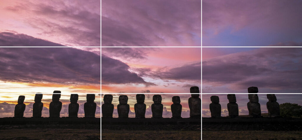
Thinking Within The Box(es) Whether your camera stays in auto mode or is locked into full manual, the composition of your image is important. Creating an aesthetic balance in your shot will help keep the viewer engaged. The most basic rule of composition is known as the rule of thirds. Regardless of the shape of your photograph, imagine there is a grid of two vertical and two horizontal lines dividing your image into nine separate boxes. The most prominent parts of your image should fall on or near these lines. This will help you create an even look throughout the photograph. In this image the goats are dividing the bottom third from the top two-thirds and also falling on the vertical grid lines. The man out of focus in the background also falls on a line to balance the image. Here the rocks are almost filling the bottom third of the image with the fishing net falling directly on the dividing line. The most prominent crane falls on the right vertical line with the cranes in the background pointing at the other line in the grid. A nearly empty sky rounds out the upper left of the image. In this image, the boy using the saw falls on the axis of two different grid lines. The I-beams on the buildings also fall on both vertical lines. Even with an atypical shape this rule will still generally apply. The boys with their tea lifted sit on third lines along with their eye line resting on a horizontal third. One third on the top and one third on the right of the image frame our subjects from behind with the corrugated door. Now when you look at your favorite paintings and photographs you will most likely see this principle jumping out at you. To look even further into how to create a captivating composition, take a look at this article about leading lines and other techniques.
Tips and Tricks: Don’t Just Lead With Lines
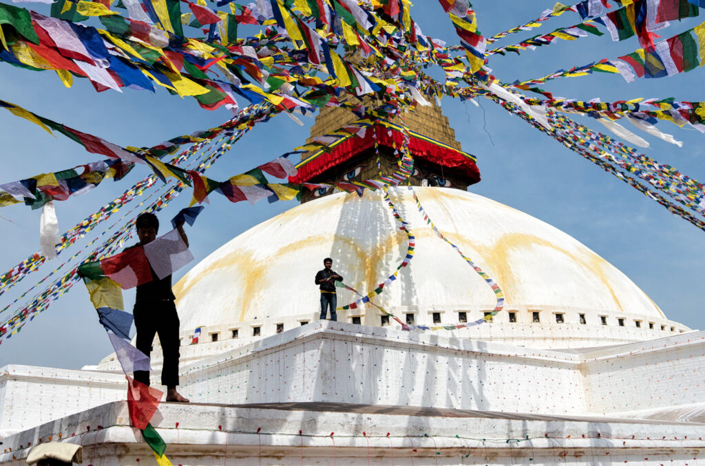
Leading The Viewer Through Your Image The rule of thirds is a great way to keep proportion in your images. Making the viewers eye move through an image is a different thing altogether. By using leading lines you can guide your viewers attention towards the focal point of the image or keep them engaged by moving their eye around the image. Sometimes this is a very apparent and deliberate line while other times it may be the way the light travels through the image taking the eye with it. This image has strong lines from every edge pulling your eye toward the alter. More subtly, the curves on the ceiling and even the light on the center aisle also direct your eye to the center. From Lines To Spirals Here the train pulls the eye from left to right with strong lines and strong contrasting colors. Once your eye hits the end of the train, the columns along with their shadows return the eye to the front of the image, and eventually the train. This takes the leading line and makes it into a circular pattern, keeping the viewer engaged in your image. A leading line doesn’t always have to be direct. Using s-curves is an effective way to draw the eye back and forth through an image. Here the highway on top pulls the viewer from left to right and then back again to meet the lower highway. After being returned to the front of the image by the lower highway, the strong shadows draw the eye back to the top highway. Diagonal lines within an image create a much stronger presence than just horizontal or vertical lines. You can use diagonals throughout your image to create a much more engaging composition. Using Light To Lead Your eye is automatically drawn to the brightest part of an image. By using light and shadow you can walk the viewers eye on the path you want through your imagery. By using the highlights created by the water’s motion, an s-curve walks the eye from the bottom right back and forth through the image eventually to the waterfall at top left. Following The Flow The abundance of prayer flags on the top of this image immediately grab the attention and pull it to the apex of the stupa (a Buddhist monument). Once there, the eye is pulled downward by the pair of prayer flags being strung by the boy at center. Next, the more prominent worker in the front left catches the viewer’s attention and then returns the eye to the top by way of his prayer flags. The Mathematically Perfect Composition In nature, almost everything that is considered to be beautiful follows a similar proportion called The Golden Ratio or The Number Phi. 1:1.618 From flowers to super models, this ratio plays out in beautiful things all around us. Without getting into the complexities of the math, simply put, the more bits and pieces of you that fall close to these proportions, the more likely people think you’re attractive. Let’s take a look at da Vinci’s Vitruvian Man. The upper to lower body generally have a proportion of 1:1.618. Same thing with the width of your mouth to the over all width of your eyes. Your knuckles relative to the length of your fingers. Your upper arm vs your lower arm. This pattern not only repeats on every inch of you, but throughout nature too. Nautilus shells and the pattern in which a sunflower’s seeds are arranged are just a couple. When you apply the power of the number phi to your compositions the same thing happens, you create a pleasing composition that engages the viewer. You can find examples of great works of art through history with the golden spiral guiding the eye through there brushstrokes. From the da Vinci’s Mona Lisa to the traditional Japanese wave to Monet’s Parisians in the Park the golden spiral is the guiding hand. Hopefully you are feeling inspired to take a second look at your photography and all that goes into it. A leading line is a great start, but if it leads you right off of the page onto the image sitting next to it, the viewer moves on. If you can keep the viewer engaged by taking their eye on a subconscious journey through your image and back again, you have done your job.
Tips and Tricks: Anchor Points
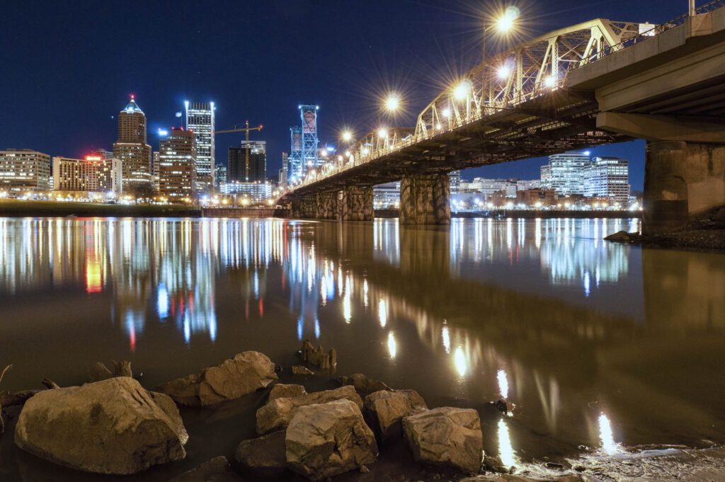
Anchor Points – Something To Ground The Viewer In Your Shot When photographing a landscape, creating a visual balance is important. By using something eye-catching in an otherwise empty space, you can lead the viewers eye back to the starting point and repeatedly lead them through the photograph. This object that draws the viewer back in is known as an anchor point. In the image above, the bridge forms a strong leading line that delivers the eye to the city. The rocks positioned in the bottom left of the frame give you something to land on when the reflection of the cities lights bring you to the bottom of the frame. After they get your attention they lead you back to the bridge starting the viewers visual journey over again. Here, the water rushing over the falls naturally causes the eye to move from left to right. The bright moss covered rock on the bottom left acts as an anchor point grabbing your peripheral vision after you’ve completed this path to start it all over again. Contrast Is Key The salt crusted branch in the bottom of the image on the left acts as an anchor point to balance the vibrant pink sky. The bright colors of the textured clouds naturally draw your eye while the white branch and its reflection pull you back to the bottom of the image. You don’t always need to be using something physical as an anchor point. In the image on the right the reflection of the sun acts as an anchor point. The silhouette of the people crossing the boardwalk in the middle of the frame grab the attention after you initially look at the sun. It’s trailing reflection in the foreground keeps the eye moving until you end up back in the sky with that bright sun. In addition to anchor points, there are a lot of other ways to bring your viewer somewhere withing your image. If you click on the following link it will bring you to a Tip and Trick about leading lines and other ways to draw the eye, so you can get a better understanding of a few of these techniques.
Tips and Tricks: Give Them Somewhere To Go
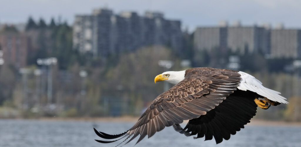
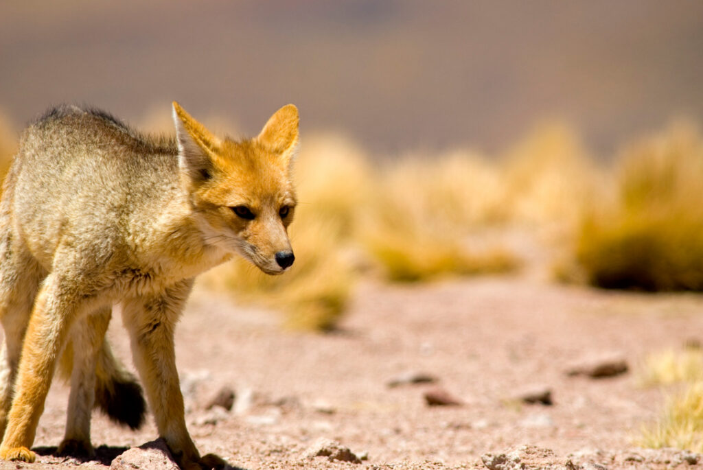
If you are a regular reader, you have probably seen a few Tips and Tricks on composition like leading lines and anchor points. When it comes to people and animals in motion, another element can also be used to keep the viewer engaged. By keeping the subject isolated in one third of the image and having them face toward the other two-thirds (rule of thirds), it gives them somewhere to go in the frame. If they are looking out of frame it often leaves the viewer wondering what the animal is looking at or where they are going next. The South American Grey Fox in the image on the left is facing into the mostly empty two-thirds of the frame. For the viewer this gives the subject a direction to go. Likewise, the eagle in the image above is headed into the frame. The buildings in the background are not distracting enough to divert your attention from the main subject, but present enough to let you know this is an urban environment. In these images I am breaking the established rules. The owl in the shot on the left is facing out of frame. To me this gives the impression that he is mourning or lamenting something. The hummingbird is filling most of the frame with his wings and tail feathers forming leading lines that flow through his beak. Even in this image with a fairly inactive subject, it gives the buffalo somewhere in the frame to move into as he grazes. Had he been facing the same direction but on the right side of the image, it would look like he’s leaving the frame. People are animals too. Make sure to also give your human subject matter somewhere to go in the frame.
Tip of the Week: White Balance
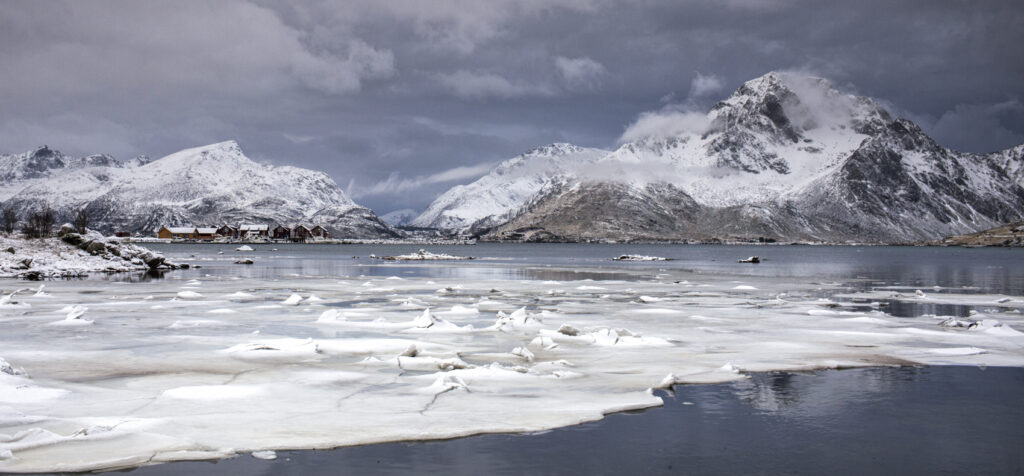
Often when we take a picture the image does not look the way it did to our eye. There are a lot of things that can cause this, but if it has to do with the color of your image, odds are pretty good changing your white balance can help. Your eyes can adjust to different colors of light very easily. Your camera does its best to give you a neutral shot (like daylight), but in tricky situations a it can often get this wrong. The image on the left is the result of a common problem, especially with indoor family photos. In auto mode the camera used its flash. The light from the flash is similar to the color of daylight. Most lights we have in our homes are much more yellow, orange or pinkish than daylight. The flash made our model look more or less normal in color, but the background light in the room is a weird pinkish-orange. For the shot on the right, I turned the flash off and raised the ISO setting in the camera (some cameras have better results than others with this). A higher ISO makes the camera more light sensitive. The resulting image looks closer to the way your eye would have seen a person in that room-both in color and also the way the shadows fall. A sunrise or sunset has very warm light. The auto white balance in your camera is still trying to choose a neutral (daylight) tone. Because of this the result is usually an odd pastel look to the color of your image instead of the beautiful sunset you remember. By setting your camera’s white balance manually to the “daylight” setting (often resembling the sun), you are telling it how to shoot and you will see those warm colors maintained in your pictures. The image on the right is much closer to the only warm thing in Norway during winter, its sunset light. When the decision is left to the camera, it tries to strip the warmth to deliver a neutral “daytime” color palate.
Grey Snow In Your Pictures Got You Down?
This time of year, whether on the slopes or in the backyard, a lot of our photos will be taken in the snow. In a scene where most of the image is white, often the beautiful snow will turn out a dingy grey tone. Your camera’s meter is reading the scene in a mid-grey tone. If you have ever taken a photography class, you may remember the grey card that you used to set your meter. That card is the tone in which your camera sees light. In an average image, this means your shadows hopefully don’t get too dark causing you to lose detail on the back side of a bush or rock while the clouds or brighter parts of the image don’t get too bright. Because your meter is looking for more or less an average shooting scenario, this ends up working well in most cases. When you step into a scenario like a white snowy scene, your camera is still trying to find that average mid-grey and your entire scene ends up being that grey tone. Don’t fret! There is an easy way to trick your meter and achieve the vibrant look you are striving for in your snowy images. In the image on the left, the camera’s meter was left to figure out the scene. Most cameras have a scene mode setting for snow – usually labeled with a snowflake or snowman icon. This is still an auto mode, but you have just told the camera what to expect in this atypical scene. If you like to shoot in the program, aperture priority or shutter priority modes, you can use the exposure compensation on your camera. By using the exposure compensation and adding 1 1/3 stops of light to the picture, your snow will be back to vibrant white. If you are comfortable shooting in manual, this is an easy thing to overcome by simply adjusting your exposure to brighten the scene by that same +1 1/3 stops. Some cameras have a physical dial to adjust the exposure compensation. Others will be set through the menu, usually initiated by a button. The dial on the left is at a neutral setting. The dial on the right has +1 1/3 of exposure compensation added to the picture being taken. This takes the dingy grey reading your meter is using and brings it back to the vibrant white snow it should be. The image on the bottom is from a point and shoot pocket camera. It has the same ability to correct for tough lighting as the more expensive camera with the dials. By pushing the +/- icon, and then using the arrows to add the same +1 1/3 to the picture, the same vibrant snow can be captured. Pro Tip: When going from a hot car or building to a cold environment, seal your camera and lens into a ziplock bag and do not open it until the temperatures have been able to equalize a bit. This will inhibit condensation from forming within your camera and lens from the dramatic and sudden temperature change.
Tips and Tricks: The Exposure Equation
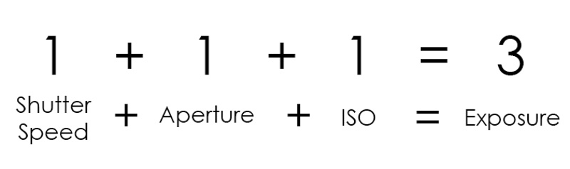
The Exposure Equation Once you leave auto mode behind on your camera, a whole world of creativity awaits you at your door step. This doesn’t have to be a daunting task once you have a little knowledge on your side. The fact that digital cameras keep information for each picture you take means you can go back later on and see what you changed from shot to shot and visually compare the results. This helps you learn a lot faster! When you are taking a picture, you are only capturing the way light is falling on your subject. Once you understand a bit about controlling the light entering your camera, you can have influence on the pictures coming out of it. The darker image on the left has been taken to maintain the details in the tree near the bright lights. The image on the right has been taken 2.5-stops brighter to expose for the shadows. Some detail was lost near the lights because it is brighter, but by increasing the exposure the leading lines of the concrete and the bark of the ceder tree take on a more dominate role in the image. The brighter street lights don’t take away from the images focus, so I don’t care that they have over exposed a bit. Neither one of these is a “correct” image. It depends on what you, the artist, wants to be the subject of your image. In the darker picture on the left, the lights of the garage and the brighter tree are really the only things you see at first. When you look closer the concrete in the shadows takes on a secondary role. Overall it is a more moody shot. I was personally looking for the result on the right so for me that was the correct image. A Few Definitions First A Stop Refers to 100% more light or less light entering your camera. This can be controlled by the shutter speed, ISO or aperture (more about that below). Exposure You’ll find this word used a couple of different ways in photography. – Every time you take a picture you have created an exposure. – The amount or balance of light entering your camera needed to make an image. Under Exposed When an image or an area within an image is too dark. Over Exposed When an image or an area within an image is too bright. Shutter Speed In your camera you have a shutter that opens and closes to let in light. The longer that shutter is open, the more light enters your camera. Anything that moves in front of your camera while the shutter is open will be picked up in your picture.* If your subject is a car driving by you would need a fast shutter speed to freeze the fast moving vehicle. Even though most pictures are taken in fractions of a second, with a fast moving subject 1/30 and 1/500 of a second can make a big difference. Depending on the camera though, the shutter speed might not always be represented as a fraction, but when you hit one second and longer there will always be quotation marks following the number to indicate seconds. You can read more about the shutter speed here. Aperture In the lens there are little blades forming a circle (roughly) that open and close to let in more or less light. If you have the aperture open wide it lets in more light. The number that represents your apertures opening will often but not always have the letter F preceding it. It is often referred to as an f-stop. The lower the number, the bigger the opening in the lens. The bigger the opening in the lens, the more light enters your camera. You can read more about how the aperture effects your depth of field here. ISO This is an indicator of how sensitive to light your camera is. The higher the number your ISO is set to, the more sensitive to light your camera is. In a digital camera you need to be careful when you reach to the higher ISO settings. A side effect known as noise (a visual distortion) becomes more present, especially in the shadows or darker parts of your image. With most current cameras you can shoot at 1600 or 3200 ISO before this noise becomes very noticeable. Some cameras are much better than others when it comes to handling high ISO shooting with low noise. Now, let’s make some sense of that math problem I threw at you in the beginning. Imagine each variable of your exposure (shutter speed, aperture & ISO) in place of the 1’s and the 3 is your overall exposure (these are hypothetical numbers). As long as you still have the same sum, you can do anything you need to with the exposure variables to achieve the effect you are looking for. Let me give you an example In the example on the left the shutter speed on the top image is set at 1/125 – too slow to freeze the action of the bicycles and car whizzing by. By raising the shutter speed three stops to 1/1000, the shutter is not open as long, therefore objects moving faster in front of the camera can be frozen more easily. Since it takes the same amount of light to make a picture, I need to add three stops to my exposure to compensate for the light I took away or else I would have a dark or under exposed image. In the equation below you can see that I raised my ISO by the same 3-stops that I took away from my shutter speed to achieve the same exposure in both images. Variables and Constants If you think about these different parts of the exposure as variables and constants, you can easily understand how to create the effects you are looking for in your pictures. With our bicyclists above, we
Tips and Tricks: Depth of Field
Depth of Field Creating a captivating photograph has a lot to do with how you lead the viewer through your image. In previous tips on composition we have discussed a few ways to do this such as leading lines, anchor points and how the direction of your subject can lead the eye. Used in all types of photography, but most noticeable in portraiture is the ability to blur the background to lead the eye where you want in the image. In the in depth look at exposure that we have recently taken, one of the exposure variables that we were talking about was the aperture. As you open the aperture in the lens to let more light in (a lower f-number), the area that stays in focus becomes more narrow. The area that is reasonably sharp in an image is known as depth of field. If the background is blurry like the example above on the right, we refer to that as a shallow depth of field. Inversely, when the background and foreground are in focus, it is known as a deep depth of field (higher f-number, less light entering lens). Like Taking A Dip In The Pool If you think about this like the depth of a pool, it makes sense. If I am on the 2ft side of a pool (like my drawing?), I am in the shallow end. If you take that water’s shallow depth and imagine it as your in focus area, you only have a small amount sharp and in focus. When you only have a small amount in focus and the rest is blurry, you have a shallow depth of field. When you are on the 16ft side of a pool, you are in the deep end. If you are at f16 on your lens you have a deep depth of field or more in focus throughout the image like the example above on the left. There not only can you see the subject, but the distracting background behind him. Zoom vs Wide Angle In a landscape image, people will often strive to have every flower in the foreground just as sharp and in focus as the mountains on the horizon. For this you would need a deep depth of field. It also would help to have a very wide angle lens to achieve this. The wider your lens, the harder it is to blur the background; the more telephoto your lens, the easier it is. In the example image to the right, the photograph on the top was shot at 35mm and then cropped to show the same field of view as the 70mm. Both lenses were shot at f2.8. You can see how much more pronounced the blur is to the background with the telephoto versus the wide angle.
Tips and Tricks – Using Shutter Speed to Create Effect in Your Images
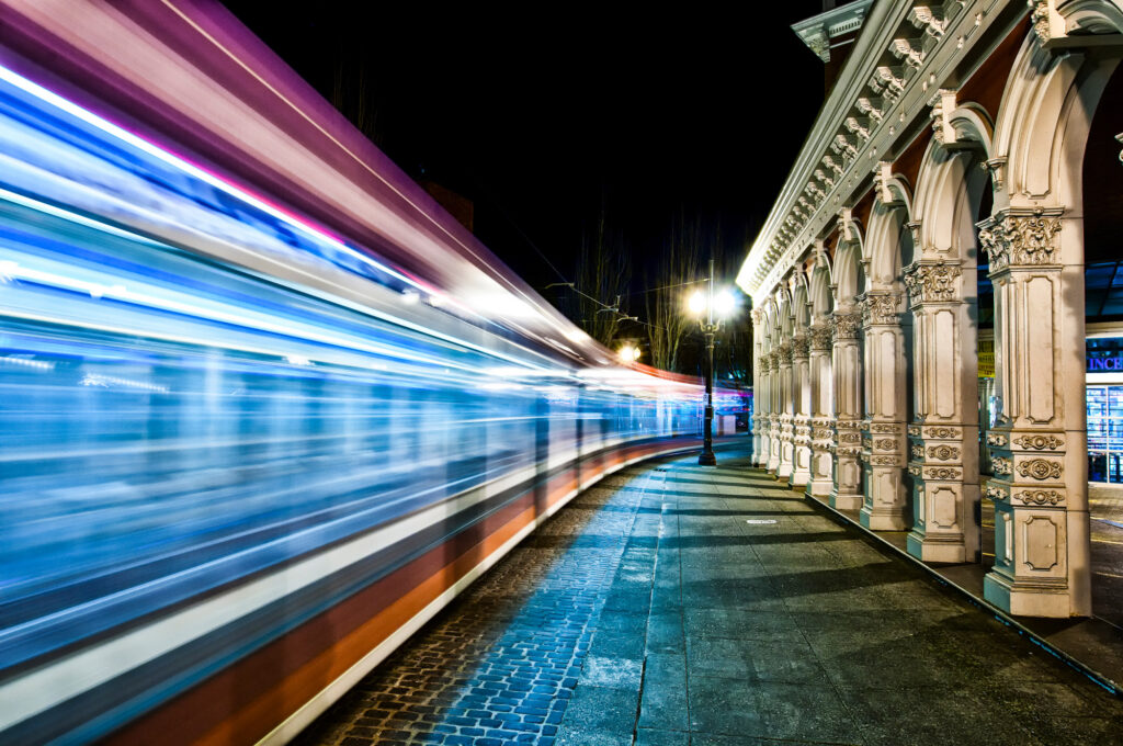
In a previous Tip and Trick we discussed how you can control the area of your image that is in focus using your aperture or your depth of field. This week we are going to talk about a few ways to use shutter speed to create effect in your images. Most of the time your striving to achieve a shutter speed fast enough to freeze action. If you take a picture of water it will often look frozen in place. In these two images with water, the shutter has been left open longer to give the water a more “painted” or wispy look. In the image up top of the train whizzing by at night, the shutter was left open for five seconds to achieve this effect. This has the same effect as the water in the previous images. While the shutter is left open, the sensor records anything passing in front of it. Over a 1/15 of a second or so of time, all of the that water passes in front of your camera is recorded in the image and you get the painted effect (depends on how fast water is moving). When the subject is something bright, you will get streaks like the lights from the train. Keeping the camera still is very important, so a tripod will be needed for pictures like these. In this photograph with the cyclist, a shutter speed of 1/15sec was used and then the camera is panned with the oncoming rider. Spot your subject through your viewfinder and as you’re panning with their movement, keep them in the same location in your composition and smoothly fire your shutter. The resulting image gives the feeling that the subject was moving instead of frozen in space. This is a great technique to play with on all sorts of moving subjects. This last example is taken to the extreme. By leaving the shutter open for a long period of time in this busy plaza in Brussels, everyone and everything has disappeared like they weren’t even there. The shutter was left open long enough, in this case two minutes, so only things that are stationary are picked up in the picture. Moving objects are not in front of the camera long enough relative to the total time of exposure to show up. You could walk through this scene right in front of your lens and as long as you didn’t stay in one place too long, you wouldn’t show up either! Of course it doesn’t hurt to know a little something about exposure to have a better understanding of this. If you follow this link it will bring you to an in depth and easy to understand look at The Exposure Equation.
Tips and Tricks: Photographing the Hidden World Around You
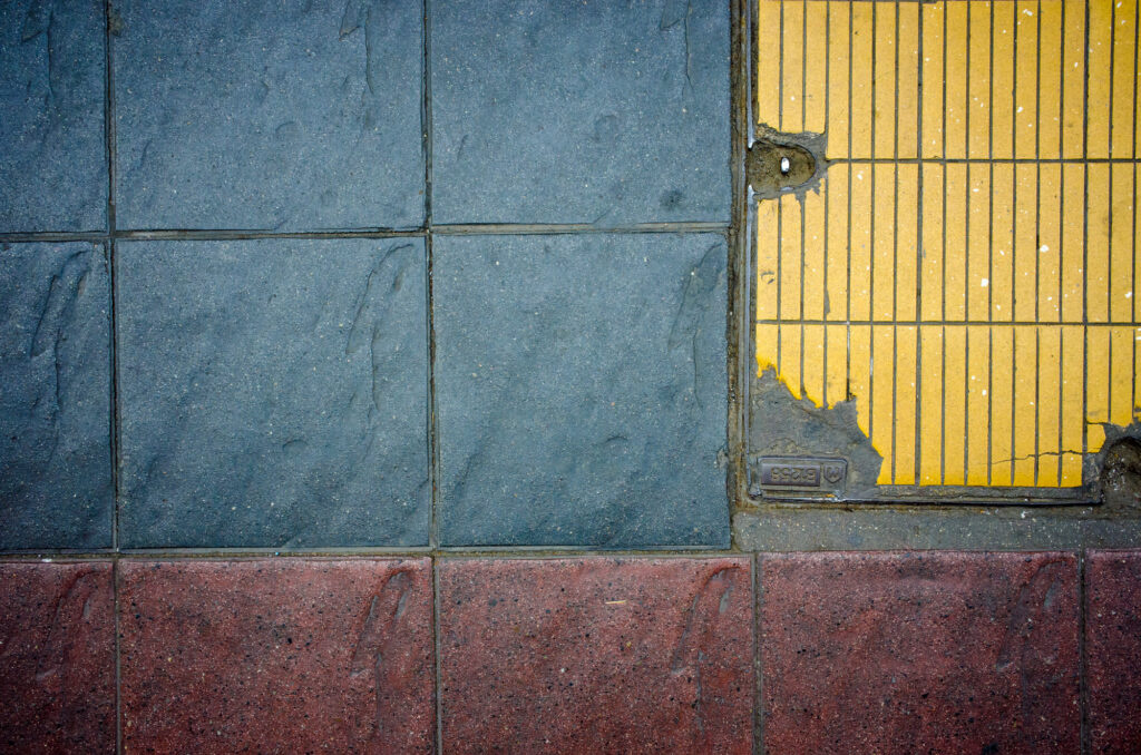
Photography doesn’t have to be all mountains and people. We walk by a whole world of untapped images everyday. By looking up, down and at all things in between, there is a realm where beauty in patterns hides. By keeping the basic rules of photography in mind (rule of thirds, leading lines, etc…) almost anything can become fodder for your lens. For me, geometric patterns seem to reveal themselves around every corner. Whether its the way power lines are crossing or paint is peeling, there is a whole world waiting to be discovered by you and your camera.